The race just heated up. On June 6th Google announced they will be acquiring Looker, the data querying and exploration tool. This is an interesting buy, considering Looker overlaps somewhat with Google’s Data Studio. (However, when I think back to the Google Next conference, I don’t recall one mention of Data Studio.) The purpose of the Looker acquisition of course is to close Google Cloud’s gap behind Amazon Web Services and Microsoft in the market for big data and business analytics solutions. According to IDC, it’s a market that could reach $260 billion by 2022.
Despite this being a big move for Google, even bigger news comes from Salesforce, which announced their plans to purchase Tableau for $15.7 billion! What does this mean for Salesforce? I have two thoughts.
First, Tableau is going to greatly expand Salesforce’s customer base. Tableau fits nicely with the Salesforce platform and technologies such as Einstein to provide an enterprise standard visualization tool that’s easier to use. This is one reason why a lot of people and companies that weren’t Salesforce customers now will be, starting with existing Tableau users who will likely bring Salesforce into their technology arsenal. Small firms, independent contractors, or just data visualization enthusiasts will soon be part of Salesforce’s monthly reoccurring revenue. (Although, not all Tableau customers are happy. While Salesforce promises to maintain Tableau’s multi-platform approach and connectivity to multiple datasets, many existing Tableau users will need to be convinced. They’re an entirely different user group than those Salesforce currently aligns with, after all.)

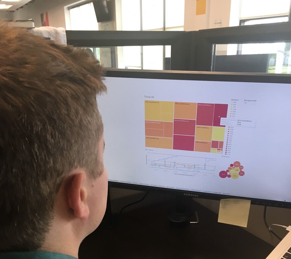
The easy-to-use Tableau environment
Second, this brings Salesforce a step closer to competing with Google and Microsoft. The two tech titans already offer data exploration tools, Data Studio (and Looker) and Power BI respectively. While these software solutions are good, I don’t think anyone would say they’re at the same level as Tableau. In fact, Tableau seems to have a certain magic to it. People not only enjoy using it, they genuinely get excited when they talk about it. Not many apps can claim that. So why is it the case with Tableau?
A Perfect Balance
And now for something completely different, Python. Python has seen a meteoric rise in the last decade. It’s gone from what some would have considered a toy language to the lingua franca of not just computer scientists, but scientists in general. Whether you’re an astronomer or a chemist, if you program at all, chances are it’s in Python. Many people attribute this success to Python’s balance of being simple yet powerful. Hello world in Python, is a simple one liner, print (“Hello World”). This requires three lines in Java or six in C (depending on how you format your code). Coupled with the ease of coding also comes decent processing speed. Yes, Python isn’t as fast as Fortran, but for someone who’s coming from Excel, it’s lightning.
Tableau appears to have also found this Goldilocks zone of “just right”. It offers a high amount of fixability for exploring data, with a very gentle learning curve. Edward Tufte, the patron saint of data visualization, summed this up well. “Graphical excellence is that which gives to the viewer the greatest number of ideas in the shortest time…”.
This appears to be the core design philosophy of Tableau. Enable users to quickly explore the data with as little training as possible. Of course, tradeoffs come with this. Is Tableau as customizable as R’s ggplot2 package, no. Does it integrate into web pages as seamlessly as D3.js, no. But the learning curve for Tableau compared to those other two is immensely easier to climb. You can sit down with a someone who’s never used Tableau, and within minutes they will be off experimenting and exploring the data on their own. And Tableau has incorporated some of the best features of these other options. It leverages the grammar of graphics that ggplot uses, and it incorporates the interactive features of D3. Yes, you lose some flexibility, but the speed you gain is well worth the compromise in most cases.
Beauty is Hard to Obtain
Anyone who’s tried to design a chart or graphic from scratch is well-aware of the drowning number of factors that need to be selected. There’s color, background color, tick marks, line opacity, scale, font size, etc. It is a daunting task. Eventually you get to a point in the process where you make an edit and you are not even sure if it was a positive change or not. If you want to get an idea of how hard it can be just to select colors, watch this YouTube talk about the process matplotlib went through to redesign their default colormap.
Fortunately, Tableau does the heavy lifting of design choices for you, and 9 times out of 10, it looks great. I asked a colleague why he likes Tableau, and he said, “It makes your data look pretty, and you don’t even have to try”. The value of pretty shouldn’t be underestimated.
In a chart, beauty is often the absence of distractions. If the colors are off, or there are too many tick marks, this distracts the audience from the message of the data. Florence Nightingale has a great example of this. She used a polar area diagram that is simple with minimal distraction, allowing the audience to instead focus on the story the data is telling (here’s a link to a Tableau workbook some make replicating Nightingale’s famous graph).

Sadly, other visualization tools are still behind in this area.
This out-of-the-box beauty from Tableau, combined with its balanced approach to user ease, has made it the de facto tool for data exploration and visualization. Tableau users are in every industry and across any job function. In fact, maybe the only data tool that is more ubiquitous than Tableau is Excel.
An Ode to Tableau
I have always really enjoyed Tableau. It’s a wonderful product that provides a great service. When I heard the news that they were acquired, my first thought was that I was happy for them. Almost as if I was hearing an old friend had gotten a great job. I still remember my first Tableau workbook. I made it during the bootcamp for my master’s program. It looked at how movie reviews from IMDb differed from Rotten Tomatoes (a topic I’d revisit again). Since then I’ve probably made over a hundred Tableau workbooks. I’ve use it so much that it’s begun to rub off on my daughter. During a time when I worked from home, she came into my office and showed me a graph she had drawn by hand with colored markers. It was a bar chart showing how much she loved different animals, number one being cats. I took it and recreated it in Tableau to show her how good her work was.

Tableau has also been essential in helping me build my portfolio. Even my data visualization that end as static images are started with me exploring the data through a Tableau workbook. Whether it was showing how many lines of code I wrote in grad school, or how many times I’ve eaten at Taco Bell, Tableau was the tool helping me tell the story.
My profile states “I’m a data scientist, data illustrator, and writer”. I may have found inspiration through artist like Nicholas Felton, and Tiffany Farrant-Gonzalez, but it’s Tableau that helped me actualize this middle role. It’s given me an artistic outlet, as well as a way to apply beauty to my day-to-day work.
Congrats to Salesforce for acquiring a great company. I hope this next phase for Tableau brings nothing but the best for the companies and people who use it—as well as for those who discover it for the first time.
To learn more about data visualization and its benefits, contact us. We’re here to help.

